Dec 02, 2010
in Drawdown, Volatility
Volatility is a tough topic to get your hands around. But one key idea is to think in terms of drawdowns -- in general, the higher the volatility the higher the drawdown. What does this mean? It doesn't mean that volatility is just bad --- it means that with funds like the Russia Fund (RSX) or Brazil (EWZ) or Financial stocks (XLF), your TIMING is more important than with something like a consumer staples ETF (XLP) or an investment grade bond fund (CIU). Since we've posted this many times this year, it's time to take a look at some actual hard data through the first 11 months of 2010.
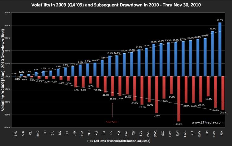
The chart below compares the known volatility exiting 2009 with the subsequent drawdown in 2010. We think this shows the basic idea pretty well. Its certainly not going to be exact --- but in general, it makes sense. So we can think about this from a higher level to help us. If our portfolio were 100% long Brazil (EWZ) all year, then the portfolio value would have moved down -24.7% off its high at one point. You didn't 'lose' -24.7% vs your starting cost --- but you did lose a big % off the high. A goal in portfolio management is to smooth out the ride a bit.
Note here that this is just one 11-month period of data. The concept is solid -- but the future will be different. The S&P 500 had a -15.6% drawdown during this particular period. Less volatile ETFs all had lower drawdowns. A few on this list that had significantly higher volatilities had lower drawdowns --- but not by much. This is for concept and its relative. If the S&P 500 has a larger drawdown next year, then expect these numbers to all be bigger when we do this again next year.
Apr 29, 2010
in Volatility
Lets look at 3 common methods different investors use to reach their goals:
Investment Advisors: a typical advisor buys a combination of stocks and bonds to dilute/diversify the risk of owning stocks alone. They participate in bull markets but give up pure equity returns in pursuit of stability. The bond component to portfolios is generally uncorrelated to equities in down equity markets. The stock portion of a portfolio is compared to a stock index and the total portfolio is compared to a blended stock-bond index.
Options Players Selling Covered Calls: This group buys the underlying stocks/ETFs and sells calls to earn extra income. If the securities go up, their securities make money. The also earn the premium and the stocks are called away. Like the advisor, they give up some upside in order to outperform in down markets (the calls they sell expire worthless to the purchaser and the income they make results in outperformance vs an index return).
Hedge Fund Long-Short Portfolio: This group holds longs and shorts. They generally have a long bias to catch upward nature of equities – but once again, their short positions protect them in down markets and dilute overall volatility. This strategy tends to avoid drawdowns well but generally does not perform as well as the first two strategies in bull markets. Essentially, the long-short portfolio is not unlike holding a mostly bond portfolio -- with a small long equity component. Think something like: 90% bonds with 10% midcap US stocks. Or 90% bonds with 10% emerging markets exposure. These kinds of portfolios are very tame -- don't drawdown much and can participate in part when equities do well. The hedge fund will not have interest rate risk so it won't act like the bond portfolios in reality -- but it is a fair comparison from a volatility perspective.
The Sharpe Ratio does a good job of enabling a comparison of these different methods.
The actual calculation of the Sharpe Ratio seems simple enough – though perhaps it is not as straightforward as you may at first think. ETFreplay.com calculates the Sharpe Ratio as the AVERAGE daily excess total return divided by the daily standard deviation. Note that the denominator is the same way an options market maker calculates realized volatility. The mean return and the standard deviation of return is the standard way you describe any 'distribution' of returns. We are unique though in that we calculate TOTAL return. We do this because ETF's represent underlying indexes --- and an index return is ALWAYS stated as total return. We are shocked at how poorly this concept is understood by professional websites, bloggers and aggregation sites like Seeking Alpha. The difference is at times significant.
In each of the mentioned strategies above, the standard deviation is being diluted with some kind of paired combination of either bonds, call selling or short selling. These are all good ideas because when you reduce volatitlity, you increase your chances of improving your Sharpe Ratio. If there is one statistic every investor should learn -- it is the Sharpe Ratio. ETFreplay.com makes it easy to understand because our charts de-compose the numerator and the denominator into visual bar charts.
If you focus only on the return of a benchmark and not Sharpe – you will get caught in the same problem the mutual fund industry has – chasing an index around in fear of losing to it in the short-run. You end up as a closet index, your performance looks great in a bull market --- but you invariably end up with low long-term returns due to the occasional large drawdown.
We like the combination of finding good relative strength investment opportunities -- and combining that with keeping an eye on your overall portfolio volatility. By relative strength, we don’t just mean limiting yourself to any one thing – such as U.S. equities. We mean looking globally and across asset-classes. The ETF market allows so many more interesting things on a global scale --- find global, cross asset-class relative strength and overweight these segments.
In the above 3 strategies, all of them essentially have portfolios with standard deviations set intentionally BELOW the S&P 500. How far below is up to each investors ability and willingness to take risk. But in the long-run, it is not hard to beat the S&P 500's sharpe ratio -- as the reward-risk relationship of the S&P 500 is quite poor -- you get a lot of volatility without a lot of return over the long-run.
We hope that our charts, our screener, our backtesting applications and all of the other pages we have created do a good job of taking portfolio concepts and making them visual and easy. This is what 'data visualization' is all about. We very deliberately designed the entire website with the Sharpe Ratio in mind.
Apr 22, 2010
in Drawdown, Volatility
Lately I have read in a few places that "investors too often equate risk with volatility." The people who say these kinds of things rarely go on to present an argument based in statistical fact. This blog post is not to say anything is absolute --- but I will show some simple recent data that hardly refutes the statement put forth on the first page of Chapter 3 in ‘the bible’ of quantitative finance ‘Active Portfolio Management’ (Grinold & Kahn, 1999): – it could not be much clearer: “Risk is the standard deviation of return.”
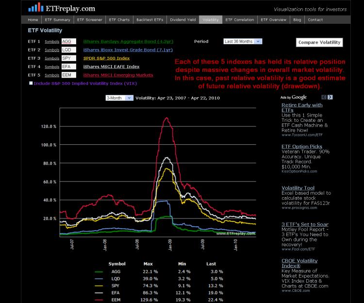
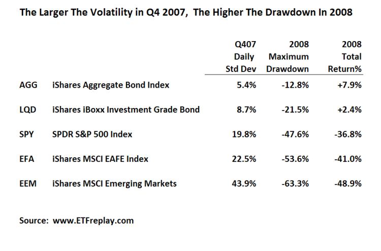
Below is data from the past bear market for 5 of the largest ETF’s in the world. I have chosen to use the standard deviation of the period PRIOR to 2008, Q4 2007. I then show the subsequent drawdown in 2008. Note how in each case of higher standard deviation, the drawdown was larger in the NEXT period.
While the above is just a sample --- I can show this over many, many more ETF's. Thinking about your portfolio from the viewpoint of standard deviation can help you understand at least in some small way about how your portfolio might drawdown relative to some common benchmarks. This chart shows volatilities across these same 5 ETF's over time. Note that each ETF has held its relative position for the past 3 years -- zero change. While you cannot know with precision what the future holds -- you can to some extent understand your relative drawdown given S&P volatility of XX.