May 27, 2010
in Relative Strength, Video
This video discusses some ideas related to our powerful Portfolio Relative Strength Backtest. The key to understanding how it works is to understand its relationship with the ETF screener
Comments and feedback appreciated.
Go to the Portfolio Relative Strength Backtest
Not a subscriber? Subscribe
May 16, 2010
in Correlation
First, a chart of GLD vs the FXE Euro Currency ETF is a simple yet powerful way to show the primary issue in the world right now:
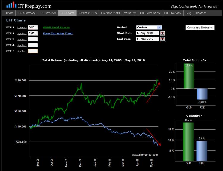
This EC (Euro currency) crisis has brought on a volatility storm (sharply rising volatility / VIX). It is common to hear analysts and portfolio managers say; what does a Greek default have to do with my US domestic small cap stock?? Well, a lot actually if the Greek problems lead to a crisis – as a crisis will cause overall market volatility to rise.
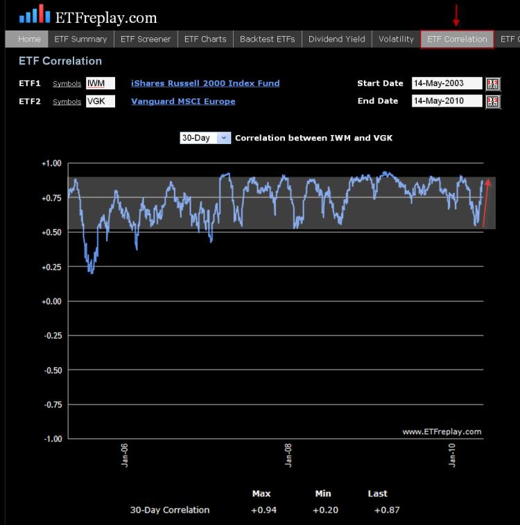
Correlations RISE in times of crisis. This is not just a random statement, it can be viewed mathematically using the Capital Asset Pricing Model (CAPM) framework.
In CAPM, the correlation between two assets can be expressed as a function of their Betas and the variance of the market. If we assume that both assets have a beta of 1.0 and identical residual risk, then it becomes mathematically true that correlations rise as variance rises. Thus, some type of crisis causes overall variance to rise (in this case it’s the escalating debt problems in Europe) and then this rising variance will cause correlations to rise.
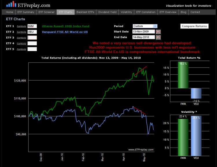
Note the serious divergence of small cap US stocks and the MSCI ETF Europe (correlation at first drops on the lower chart) -- and then the subsequent increase in ETF correlation when VIX / volatility increased sharply.
For a more complete technical explanation of this topic see "Active Portfolio Management" (Grinold & Kahn, 2000). This book is extremely technical and really only for professional investors with mathematical orientation.
May 11, 2010
in Stop Loss
In portfolio management, the term strategic is code for long-term. The term tactical is used as a way to describe a strategy that is shorter-term, such as a portfolio adjustment based on seasonality.
So for example, you may want to own the India Fund (INP) in a strategic long-term sense --- though you may be underweight on a tactical/short-term basis etc… Or you may not care about the Gold ETF (GLD) long-term but you see a tactical opportunity in it now --- something we have highlighted recently.
We know that you can greatly improve your Sharpe Ratio by employing some relative strength strategies to your ETF investing. One of ETFreplay.com’s primary strengths is allowing users to easily test various overweight/underweight methods. Our relative strength application ‘updates’ on a pre-defined date -- we do not use stop loss orders. The ‘stop’ is in effect the next update period. We view this as a far superior method as it removes the emotional nature of the markets and keeps you from acting on whipsaws, like we saw last Thursday. But the primary benefit of this framework is that it keeps you focused on the bigger picture -- and it is global asset allocation that ultimately drives 90%+ of your portfolio returns. Is your portfolio positioned correctly as of the end of each quarter? Is it positioned correctly at the end of each month? You can of course update your portfolio during any day – but hopefully, you are doing this in accordance with a larger strategic plan.
If you plan ahead and watch your overall volatility, you can sleep at night knowing that you have the Sharpe Ratio on your side. Over the long-term, the relative strength models will find markets that go up ---- and good portfolio management will limit your drawdowns. If instead you recklessly buy a list of securities and have no idea what your portfolio volatility even is --- then you are going to be placed in some very difficult situations. The key is to plan ahead of time. Hopefully, our models and backtests can aid you in this thought process and help you find some good reward-risk situations to overweight.
On Monday, the market gapped up a very large percentage on the nearly 1 trillion Euro bailout. Importantly, this followed a very significant correction in European stocks. This is the kind of thing that is a more technical aspect of tactical portfolio moves. Indeed, vicious short squeezes should be viewed as the norm after sharp market corrections, like that experienced in Europe. This is the very definition of volatility.
Precious metals --- Gold (GLD) and the precious metals ETF (DBP) are the thematic leaders of the market now. Be on guard regarding your overall portfolio as volatility has surged – but keep your tactical trades in line with your strategic ideas and you will consistently be updating your portfolio with the best reward-risk situations. Combined with intentionally keeping your volatility low, your Sharpe Ratio will rise – and this should be your ultimate focus.
Apr 29, 2010
in Volatility
Lets look at 3 common methods different investors use to reach their goals:
Investment Advisors: a typical advisor buys a combination of stocks and bonds to dilute/diversify the risk of owning stocks alone. They participate in bull markets but give up pure equity returns in pursuit of stability. The bond component to portfolios is generally uncorrelated to equities in down equity markets. The stock portion of a portfolio is compared to a stock index and the total portfolio is compared to a blended stock-bond index.
Options Players Selling Covered Calls: This group buys the underlying stocks/ETFs and sells calls to earn extra income. If the securities go up, their securities make money. The also earn the premium and the stocks are called away. Like the advisor, they give up some upside in order to outperform in down markets (the calls they sell expire worthless to the purchaser and the income they make results in outperformance vs an index return).
Hedge Fund Long-Short Portfolio: This group holds longs and shorts. They generally have a long bias to catch upward nature of equities – but once again, their short positions protect them in down markets and dilute overall volatility. This strategy tends to avoid drawdowns well but generally does not perform as well as the first two strategies in bull markets. Essentially, the long-short portfolio is not unlike holding a mostly bond portfolio -- with a small long equity component. Think something like: 90% bonds with 10% midcap US stocks. Or 90% bonds with 10% emerging markets exposure. These kinds of portfolios are very tame -- don't drawdown much and can participate in part when equities do well. The hedge fund will not have interest rate risk so it won't act like the bond portfolios in reality -- but it is a fair comparison from a volatility perspective.
The Sharpe Ratio does a good job of enabling a comparison of these different methods.
The actual calculation of the Sharpe Ratio seems simple enough – though perhaps it is not as straightforward as you may at first think. ETFreplay.com calculates the Sharpe Ratio as the AVERAGE daily excess total return divided by the daily standard deviation. Note that the denominator is the same way an options market maker calculates realized volatility. The mean return and the standard deviation of return is the standard way you describe any 'distribution' of returns. We are unique though in that we calculate TOTAL return. We do this because ETF's represent underlying indexes --- and an index return is ALWAYS stated as total return. We are shocked at how poorly this concept is understood by professional websites, bloggers and aggregation sites like Seeking Alpha. The difference is at times significant.
In each of the mentioned strategies above, the standard deviation is being diluted with some kind of paired combination of either bonds, call selling or short selling. These are all good ideas because when you reduce volatitlity, you increase your chances of improving your Sharpe Ratio. If there is one statistic every investor should learn -- it is the Sharpe Ratio. ETFreplay.com makes it easy to understand because our charts de-compose the numerator and the denominator into visual bar charts.
If you focus only on the return of a benchmark and not Sharpe – you will get caught in the same problem the mutual fund industry has – chasing an index around in fear of losing to it in the short-run. You end up as a closet index, your performance looks great in a bull market --- but you invariably end up with low long-term returns due to the occasional large drawdown.
We like the combination of finding good relative strength investment opportunities -- and combining that with keeping an eye on your overall portfolio volatility. By relative strength, we don’t just mean limiting yourself to any one thing – such as U.S. equities. We mean looking globally and across asset-classes. The ETF market allows so many more interesting things on a global scale --- find global, cross asset-class relative strength and overweight these segments.
In the above 3 strategies, all of them essentially have portfolios with standard deviations set intentionally BELOW the S&P 500. How far below is up to each investors ability and willingness to take risk. But in the long-run, it is not hard to beat the S&P 500's sharpe ratio -- as the reward-risk relationship of the S&P 500 is quite poor -- you get a lot of volatility without a lot of return over the long-run.
We hope that our charts, our screener, our backtesting applications and all of the other pages we have created do a good job of taking portfolio concepts and making them visual and easy. This is what 'data visualization' is all about. We very deliberately designed the entire website with the Sharpe Ratio in mind.
Apr 22, 2010
in Drawdown, Volatility
Lately I have read in a few places that "investors too often equate risk with volatility." The people who say these kinds of things rarely go on to present an argument based in statistical fact. This blog post is not to say anything is absolute --- but I will show some simple recent data that hardly refutes the statement put forth on the first page of Chapter 3 in ‘the bible’ of quantitative finance ‘Active Portfolio Management’ (Grinold & Kahn, 1999): – it could not be much clearer: “Risk is the standard deviation of return.”
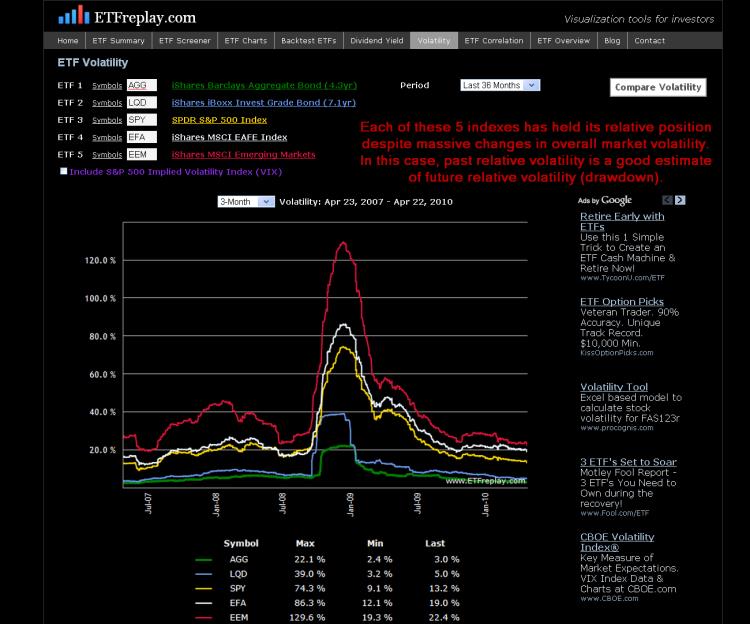
Below is data from the past bear market for 5 of the largest ETF’s in the world. I have chosen to use the standard deviation of the period PRIOR to 2008, Q4 2007. I then show the subsequent drawdown in 2008. Note how in each case of higher standard deviation, the drawdown was larger in the NEXT period.
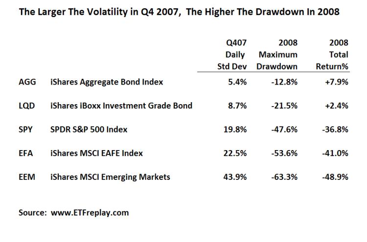
While the above is just a sample --- I can show this over many, many more ETF's. Thinking about your portfolio from the viewpoint of standard deviation can help you understand at least in some small way about how your portfolio might drawdown relative to some common benchmarks. This chart shows volatilities across these same 5 ETF's over time. Note that each ETF has held its relative position for the past 3 years -- zero change. While you cannot know with precision what the future holds -- you can to some extent understand your relative drawdown given S&P volatility of XX.