Oct 20, 2010
in Relative Strength
We showed a few examples of some very basic relative strength techniques at a recent investor event.
This example was meant to show a relative strength strategy that easily could have been thought of as unbiased at any point in past 10 years -- or right now for that matter.
For simplicity, we have used the global regional ETFs and have simply covered the major parts of the 'developed world'. We know that emerging markets have been excellent performers over the past 7-8 years -- as have selected other assets like Gold -- but we have intentionally left these out. We wanted to show something that had some poor performing picks, a few good ones and therefore representative of someone who didn't pick ETFs particularly well but implemented a sound technique to stay with leaders and avoid large underperformers.
Importantly, we believe investors SHOULD decide first which ETFs they would like to be involved with and exclude those they have no interest in on a fundamental basis -- this is value-add to a basic, mechanical technique such as this.
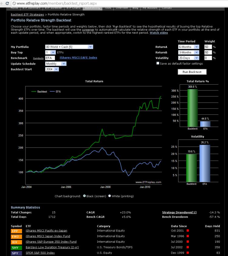
So for this example we use the World Index as a starting point and seek to just 'cover' the developed regions:
Current Approximate Weightings in Global Indexes are:
| United States |
42.0% |
| Developed Europe |
25.0% |
| Japan |
7.0% |
| Developed Pacific [1] |
7.0% |
| Canada |
4.5% |
***Emerging Markets Excluded
[1] Developed Pacific is ~97% Australia/Hong Kong/Singapore and 3% 'other' (New Zealand etc..)
From an indexing perspective, Canada is always kind of the lonely child. Canada is generally not included within a broader regional ETF -- and is not generally lumped with the United States for a North American ETF. For conservatism here, I will exclude Canada and use the first 4 only. These are logical regions in our view. We get coverage of many different countries within this regional framework so this seems quite fair and hardly something that could not have been thought of many years ago -- or even today.
We will include the first 4 from above and SHY, a <2-year duration U.S. Treasury ETF which will act as a benchmark for positive returns. If no region of the world is beating 2-year maturity short-term fixed-income -- then SHY will by default be thought to be the highest Relative Strength ETF.
Here is the result using a 6-mo / 3-mo 2-factor relative strength model with monthly re-balancing.
Note all historical results are purely hypothetical and meant to show the mechanics of the backtesting application. This does not represent investment advice.
Symbol list here is: SPY, EWJ, IEV, EPP, SHY
Sep 20, 2010
in Moving Average
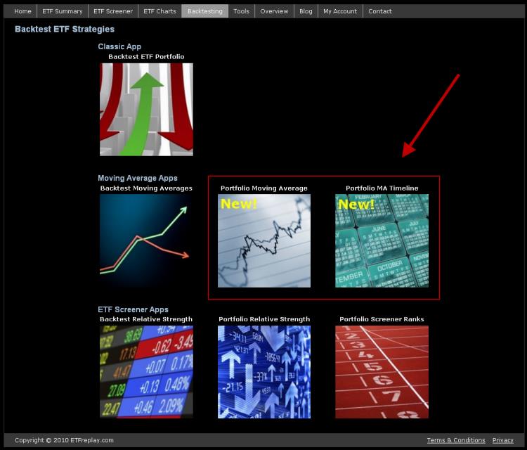
If you have created a portfolio list on ETFreplay, we are building new applications to leverage your ETF lists.
We have two new modules out that we have been working on for the past few months. These applications offer simplified views to help us try to understand larger forces at work in the global marketplace.
Building upon academic research regarding the use of moving averages, these apps save investors time by allowing many calculations and quantitative analyses to be simplified into a few clicks. We think that creating specific entry/exit rules and creating a detailed strategy report adds value to better understanding a concept. That is, we create apps that convert concepts into tangible, specific techniques. The accountability of these techniques is built into the very architecture of the website. On any day, you are just a click away from an updated view of the profit and loss history of a particular strategy.
Importantly, this type of research should be used as a complement to other forms of research. We suggest you think about which types of ETFs you want to be involved with over the long-run and then use techniques such as relative strength and moving average backtesting to help you research methods that reduce risk of a large drawdown, while potentially offering to enhance your return as well.
ETFreplay.com/backtest.aspx
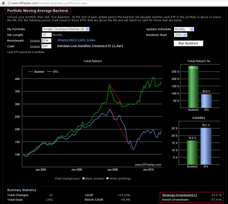
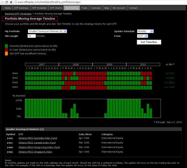
The example below uses 4 key smaller developed markets outside Europe & the U.S.
1. EWA iShares MSCI Australia Index
2. EWC iShares MSCI Canada Index
3. EWH iShares MSCI Hong Kong Index
4. EWS iShares MSCI Singapore Index
Jul 28, 2010
in Relative Strength
This summer is a good reminder that ETF investing does not revolve exclusively around equities. After assuming a leadership role in early May, many non-equity forms of ETFs have made repeated new highs over the past few months. Treasury Bond ETFs have been the most obvious example of relative strength but other groups performing well include: the Master Limited Partnership products (AMJ), Emerging Market Bond ETFs (EMB, PCY), Preferred Stock ETFs (PFF,PGX, PGF) and more recently, U.S. Utility Stock ETFs (XLU, IDU, VPU).
What do the majority of these ETFs have in common? Most of the recent 6-month ETF list of new highs involves indexes associated with yield (and lower relative volatility vs the S&P 500).
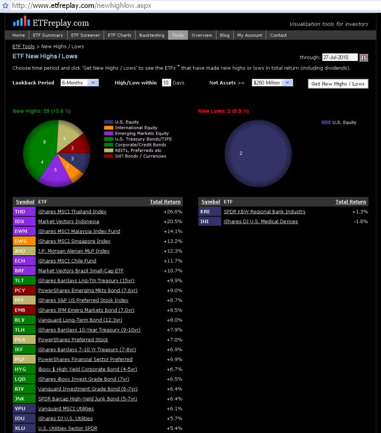
Try the interactive functionality of the above webpage here: New Highs and Lows App
With regard to equities, we’ve seen some new multi-month highs made in some select Asian and Latin American equity indexes. We will be watching to see to what extent other equity country funds can confirm this new potential leadership area (emerging markets equity).
U.S. stocks made fresh six-month lows at the beginning of this month. The drawdowns of some of the primary indexes this year have been -15.7% for the S&P 500, -20.1% for the Russell 2000 (IWM) and -22.8% for the Vanguard Europe ETF (VGK) (drawdown is the maximum high to low correction using closing prices). These groups have rallied hard over the past 20 days but they appear to be in a holding pattern as evidenced by their poor/mediocre rankings on 3 & 6 month relative strength lists.
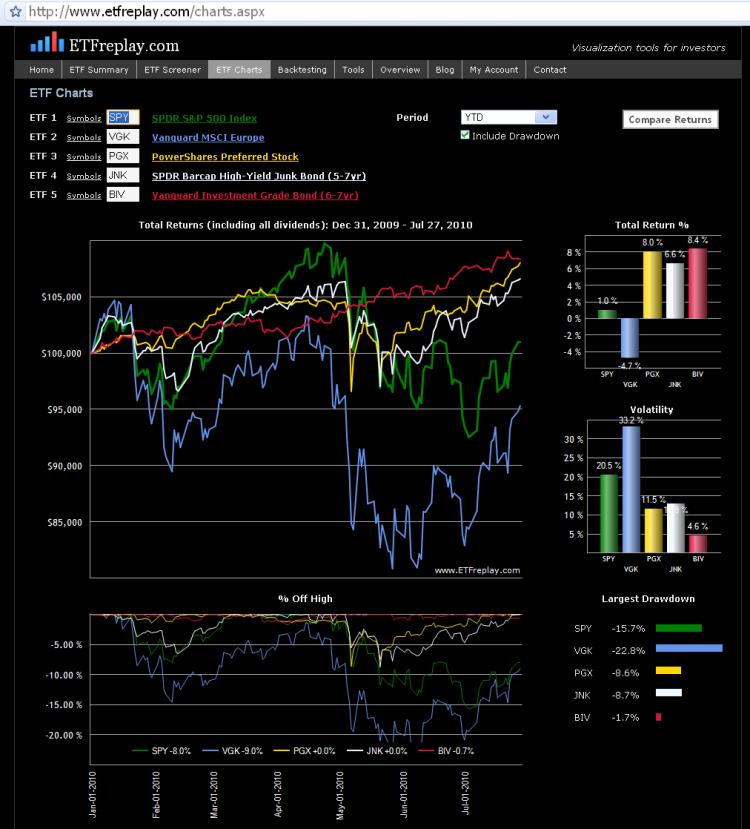
Another important item to point out is that owning bonds and yield-oriented hybrid securities (like those listed above) has been a LOWER volatility method to making money these past few months.
When the market gets volatile – as it does during corrections – buying inverse ETFs may seem like a good way to make money -- but remember, the Sharpe Ratio penalizes for volatility and you must expect large returns to offset taking on such rising volatility environments. Short-sellers have been punished hard this month while lower volatility funds (like those listed above) have appreciated.
In some respects, owning bonds -- particularly treasuries -- is a dominant method over shorting stocks. The volatilities are far lower if you keep your maturities reasonable. Thus you can express a bearish view without taking the same risk as you do during hard short-squeezes in equity markets.
We think it’s important to stay abreast of what the market itself is telling us through relative strength. When combined with your own fundamental ETF ideas, this market-generated information can be the key edge you have in terms of finding profitable entries and exits.
As we proceed further into the 2nd half of 2010, we have every intention of finding market segments that stay consistent with our global relative strength models. Near-term, look for pullbacks in some of the improving relative strength ETFs to make any adjustments necessary to your portfolios net exposures.
Jul 08, 2010
in Relative Strength
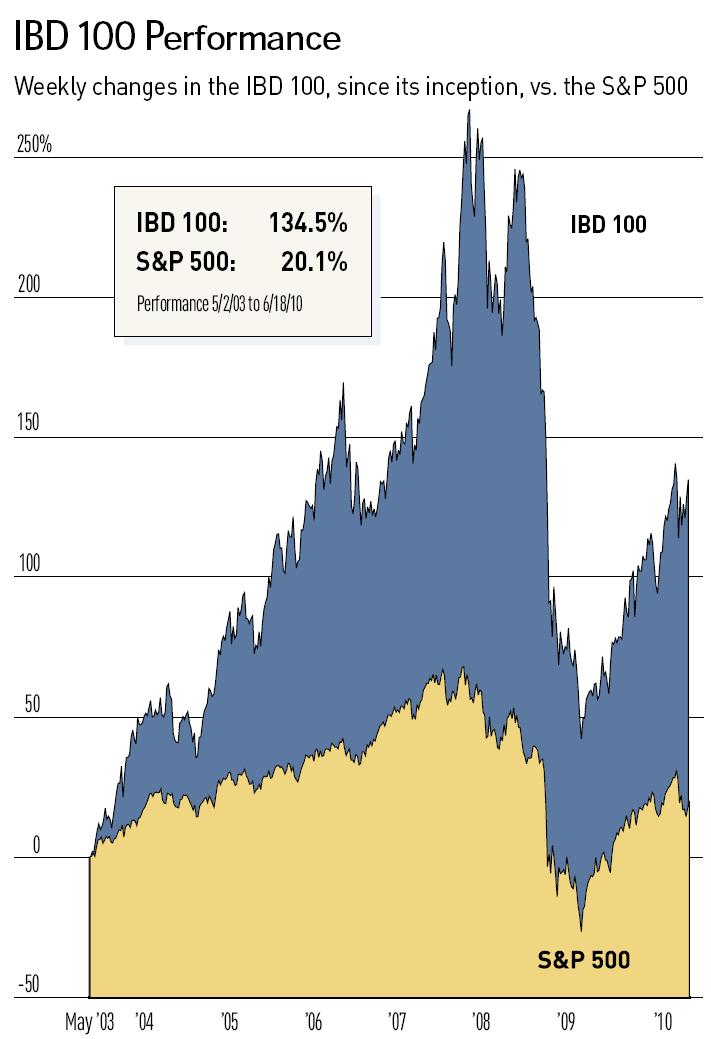
The Investors Business Daily (IBD) 100 is at its core a Relative Strength backtest of the IBD stock universe. Note that IBD's method is to also use its larger market BUY and SELL signals and these do not show up in the chart below.
If you use fixed-income ETFs in your ETFreplay screening / backtesting lists -- you effectively automate the 'Buy-Sell' signals by naturally rotating into the higher relative strength bond ETFs as stocks breakdown and bonds rally. We suggest using intermediate or short-term bond ETFs in your lists. Long-dated treasury ETFs can suffer from very high volatility -- and a key concept is to avoid highly volatile securities UNLESS they offer high expected returns. This is unlikely the case for most bond ETFs -- bond ETFs best attribute is their stability in times of turbulence.
Note also that while the IBD 100 is compared to the S&P 500 below, it does often own foreign stocks that trade on U.S. exchanges. While we cannot calculate the volatility of the IBD-100 since we don't have the data series, we suspect its volatility is far greater than the S&P 500. Remember that when volatility is HIGHER, you would EXPECT larger relative drawdowns.
This image captures the cumulative return of the IBD 100 index up through June 18, 2010 (note the massive drawdown in 2008).
Jun 13, 2010
in Screener, Video
ETF rotation is the focus of this video - showing how the Portfolio Screener Ranks tool can be used as an easy way to visualize leadership in custom ETF lists created by the user.
This video shows this new functionality by using recent news involving Bill Gross of Pimco and how relative strength LEADS the news.